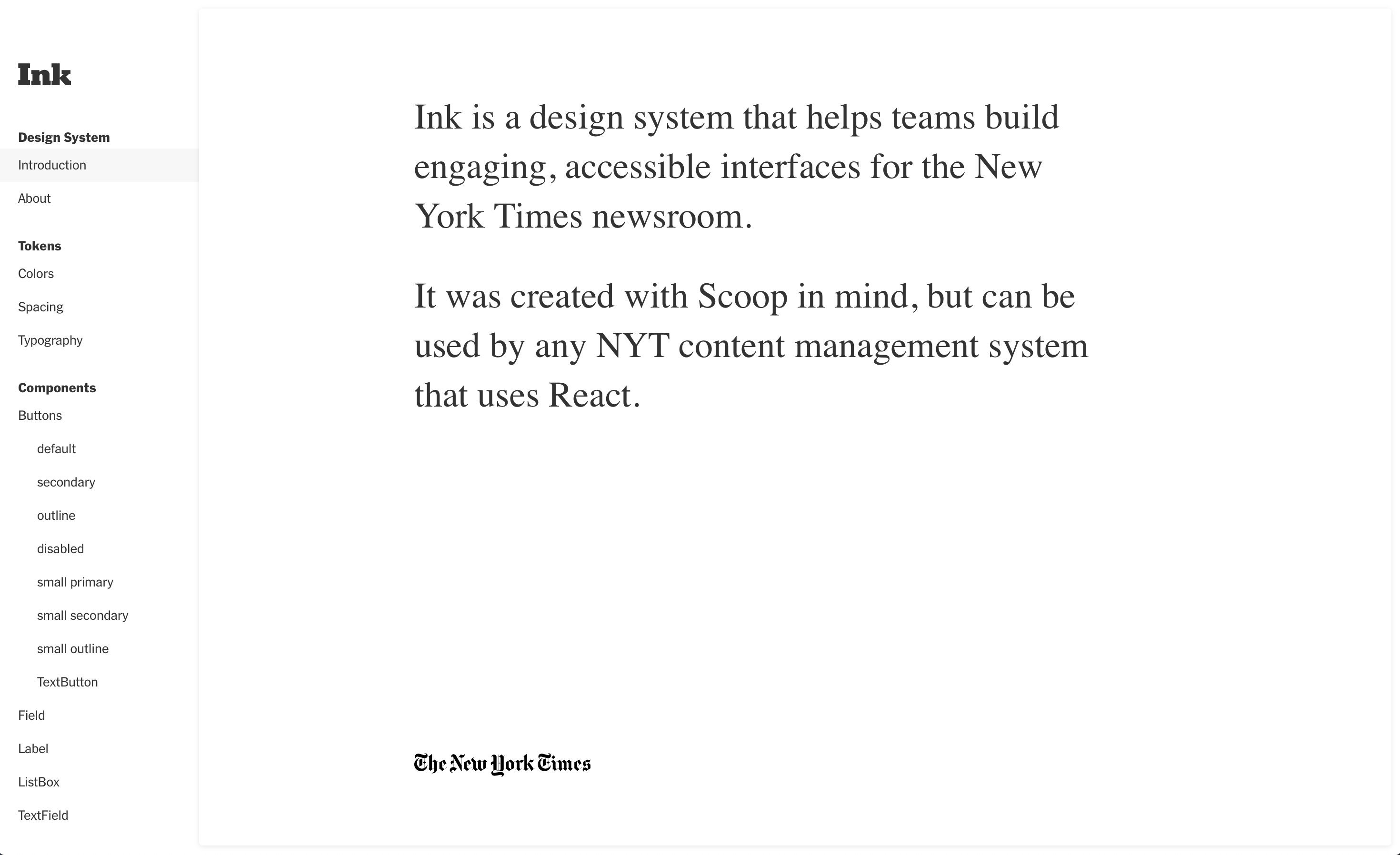
A Tale of 100 Blue Buttons
Some background
Meet Scoop. It's been here for a while.
              $ cd cms-web && git log --reverse
              commit 3f9d610975ab255fc94614ef856e4217a9cc71a9
              Author: afishman
              Date:   Tue Jul 22 20:31:17 2008 +0000

                  git-svn-id: https://svn.prvt.nytimes.com/svn/cms/trunk/cms/trunk@291 fae600c7-25aa-4c1f-88b8-96a10973b8dd
              $ ls | grep cms-ui
              cms-ui-common                  cms-ui-module
              cms-ui-oakarticle              cms-ui-article
              cms-ui-scoop-monitor           cms-ui-admin
              cms-ui-oak                     cms-ui-common-views
              cms-ui-common-services         cms-ui-video
              cms-ui-redux-modules           cms-ui-console
              cms-ui-collection              cms-ui-watchingrecommendation
              cms-ui-paidpost                cms-ui-image
              cms-ui-indexing
              cms-ui-document
The Newsroom
Newsroom Pain Points
- Digital-first newsroom → more responsibility for journalists
- Context switching from one tool to the next
- RSI from tons of mouse and keyboard work
Developers
Developer pain points
- Too many decisions to make
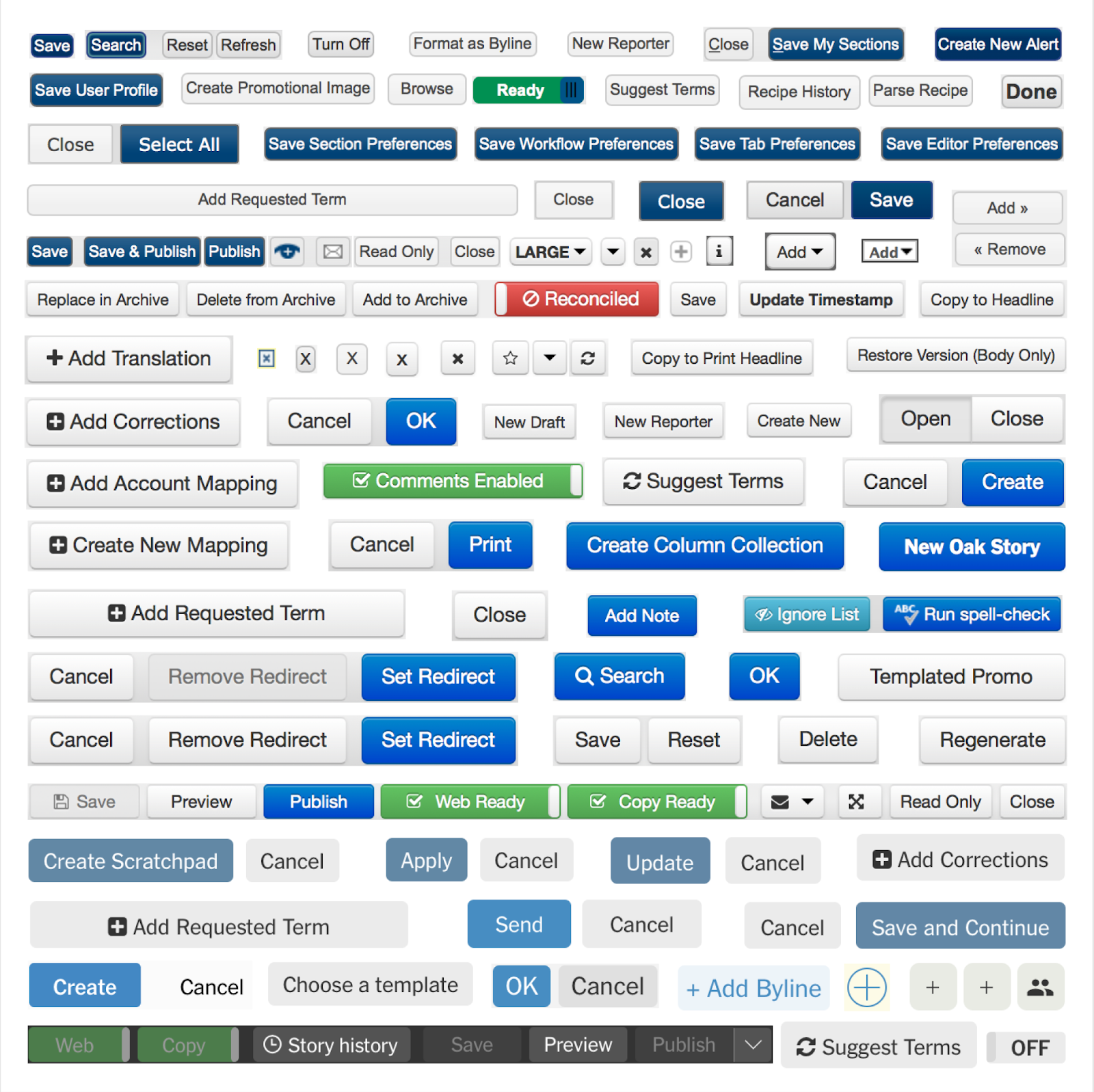
- Existing component libraries have inconsistent APIs, or are missing things
- Not a11y experts, but want to make accessible products
- No process for updating shared components
Designers
Designer pain points
- Too many decisions to make
- Hard to stay in sync with what design decisions other teams are making
- Constantly need to rebuild the wheel (e.g. buttons) in order to make a simple screen
What is a Design System?
...
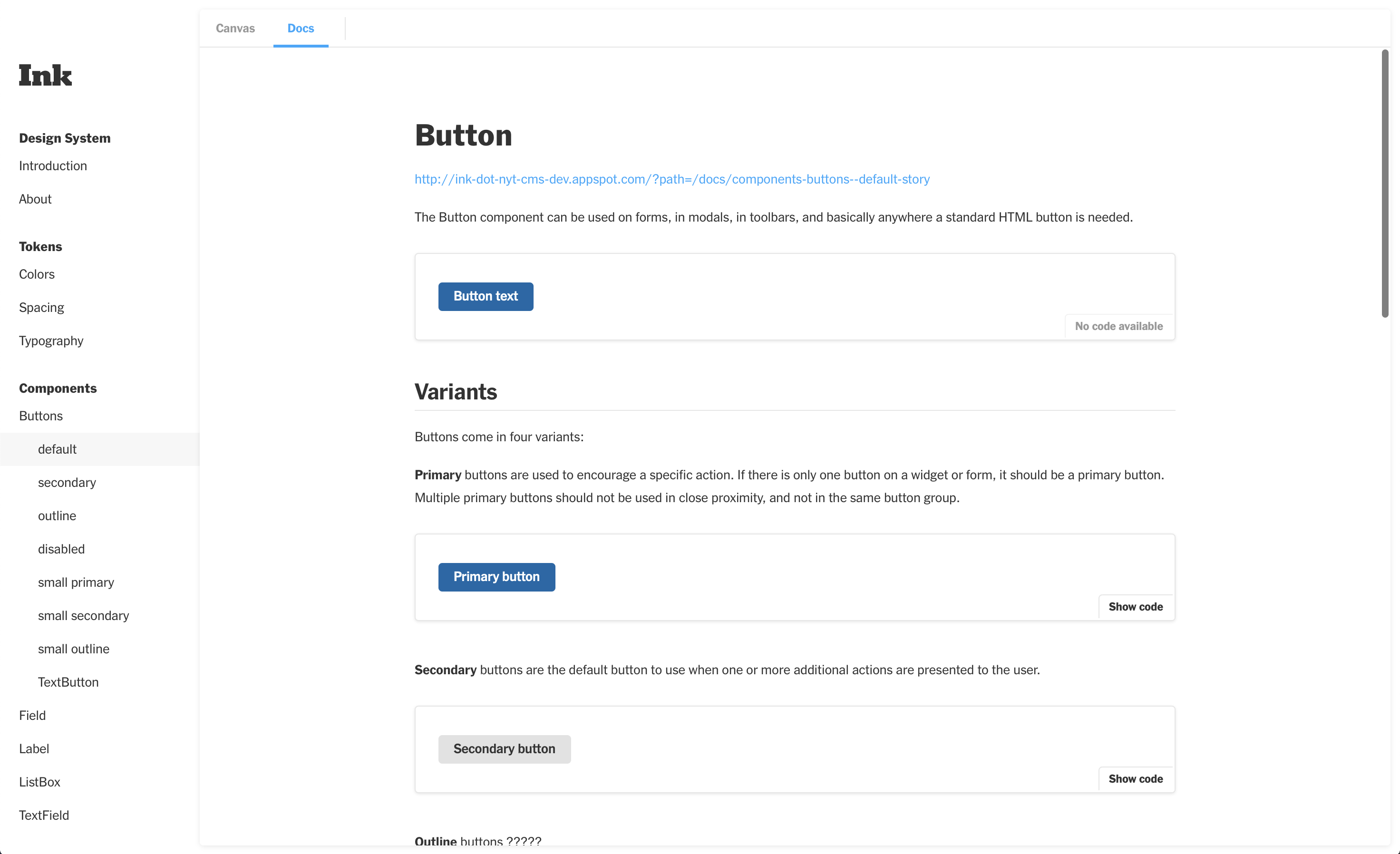
How can our design system address newsroom pain points?
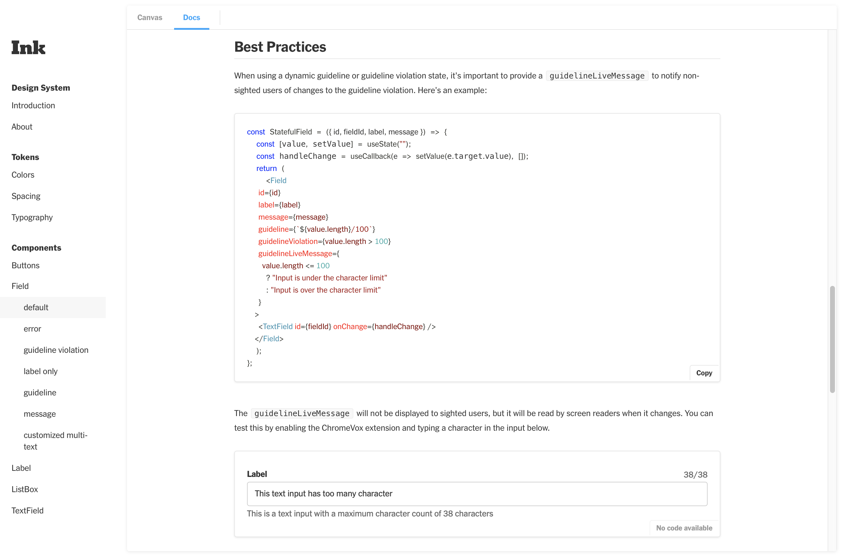
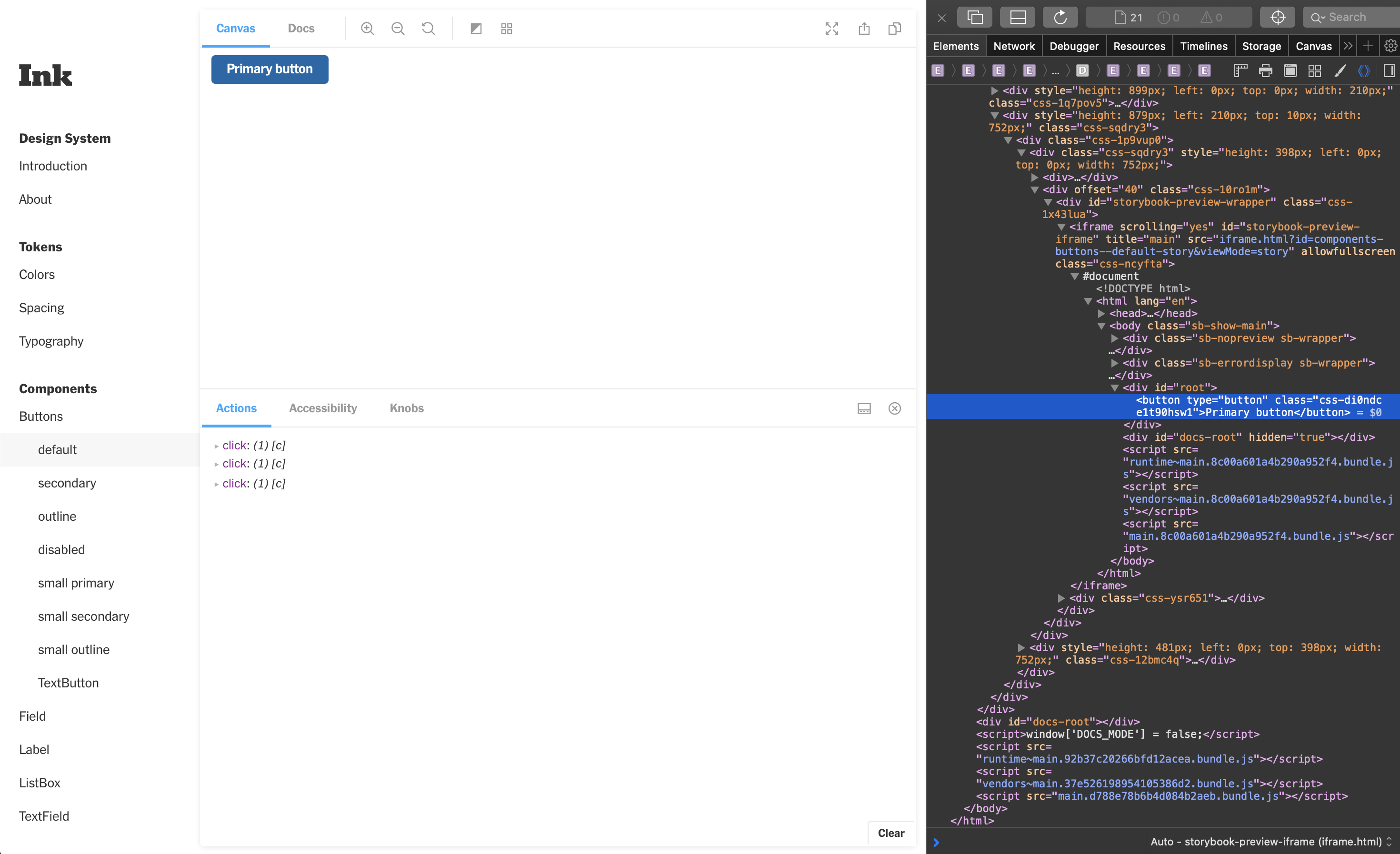
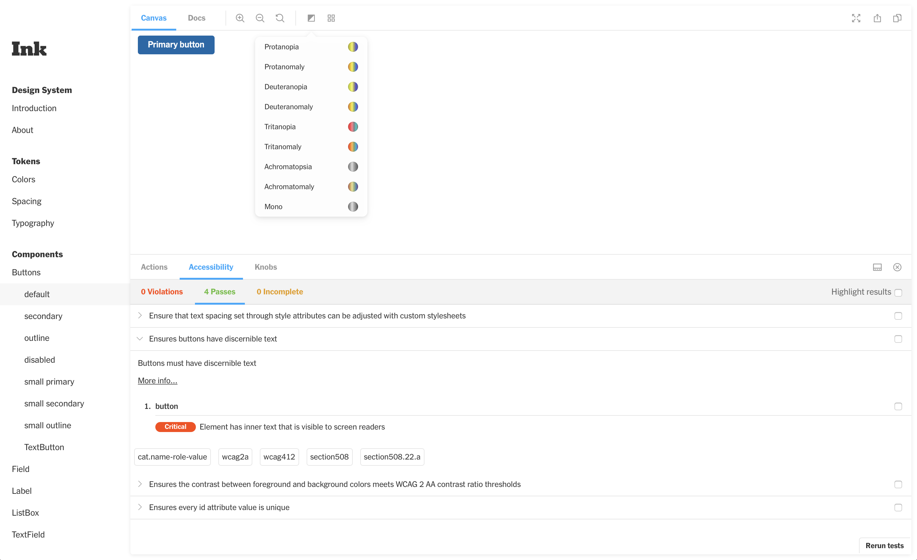
- Full WAI-ARIA spec compliance
- Consistent usage across apps (which means product and developer buy-in)
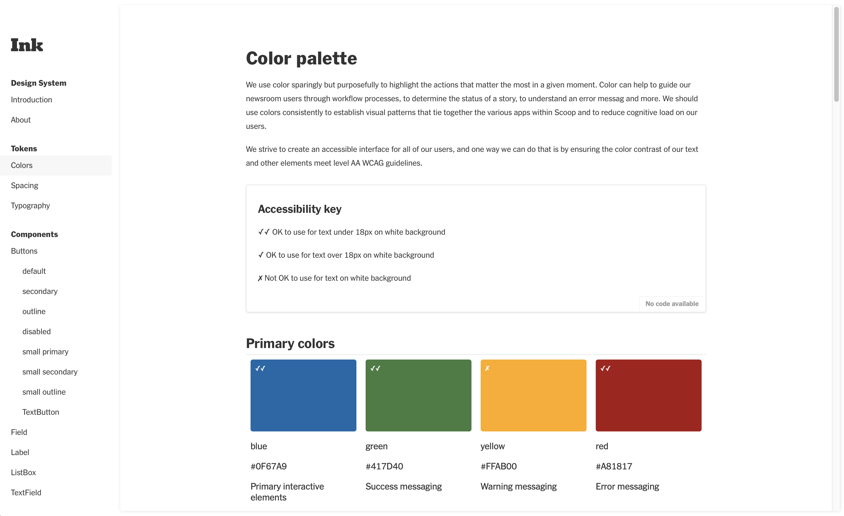
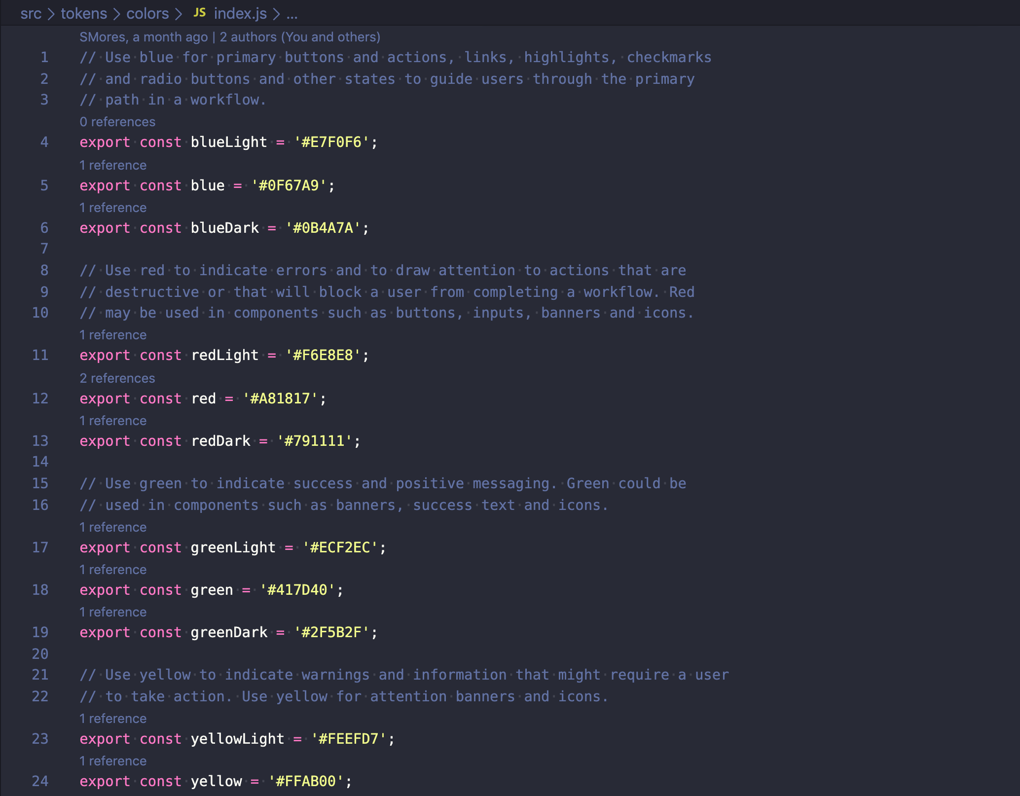
- Carefully selected and intentional color usage, both for a11y and productivity
How can our design system address developer and design pain points?
- Good, readily available documentation
- Consistent API that covers supported use cases
- Components should do one thing well, no swiss army knives
Filling our toolbox: Storybook, React, and Emotion
Tokens